Akereos Rebrand
PROJECT: Visual identity rebrand.
ROLE: Art direction and design.
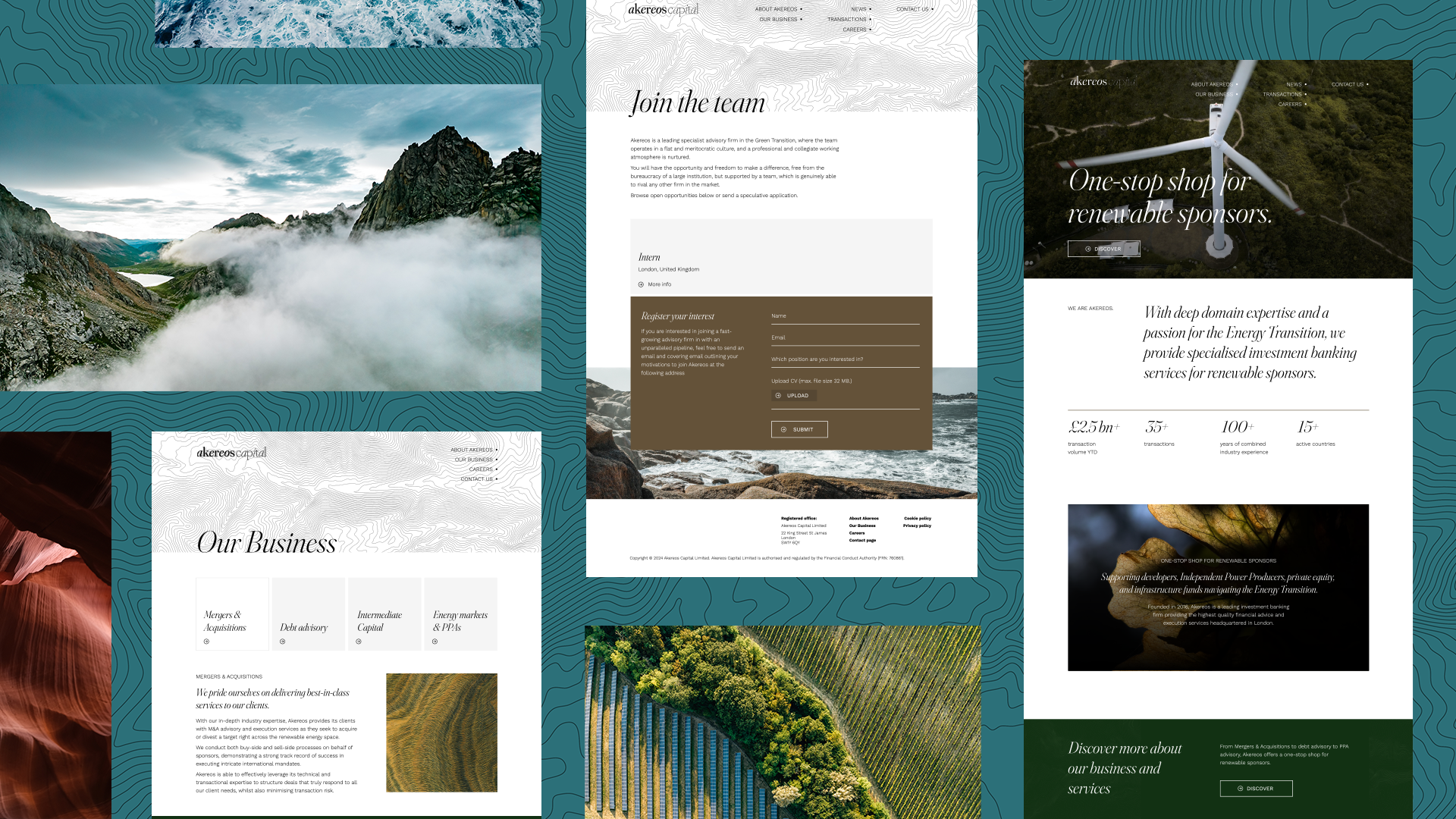
Akereos Capital is an investment bank specialising in the energy transition, and their team approached us to revamp some of their marketing collateral. But what started as a request for a Powerpoint glow-up grew into something much more ambitious.
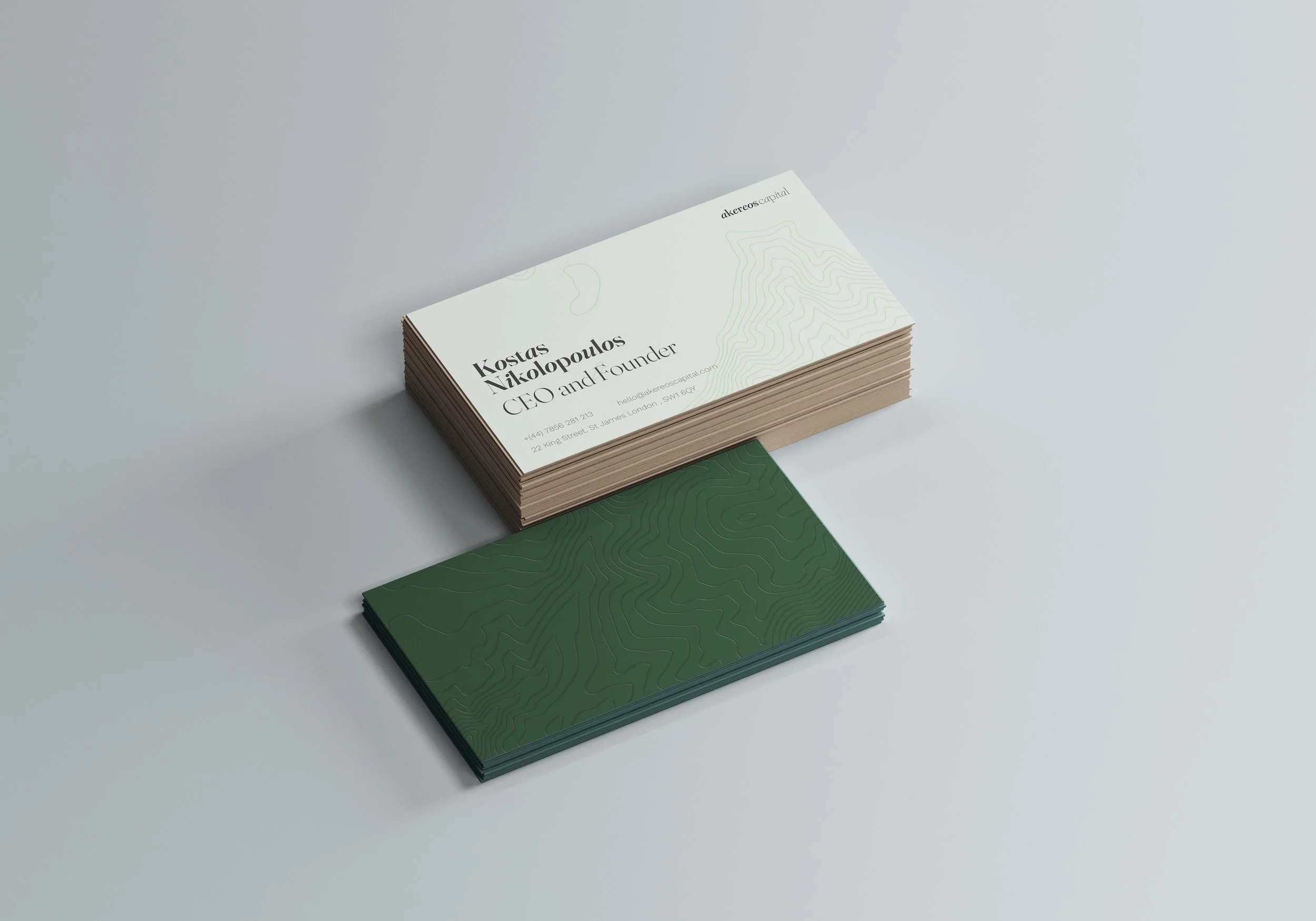
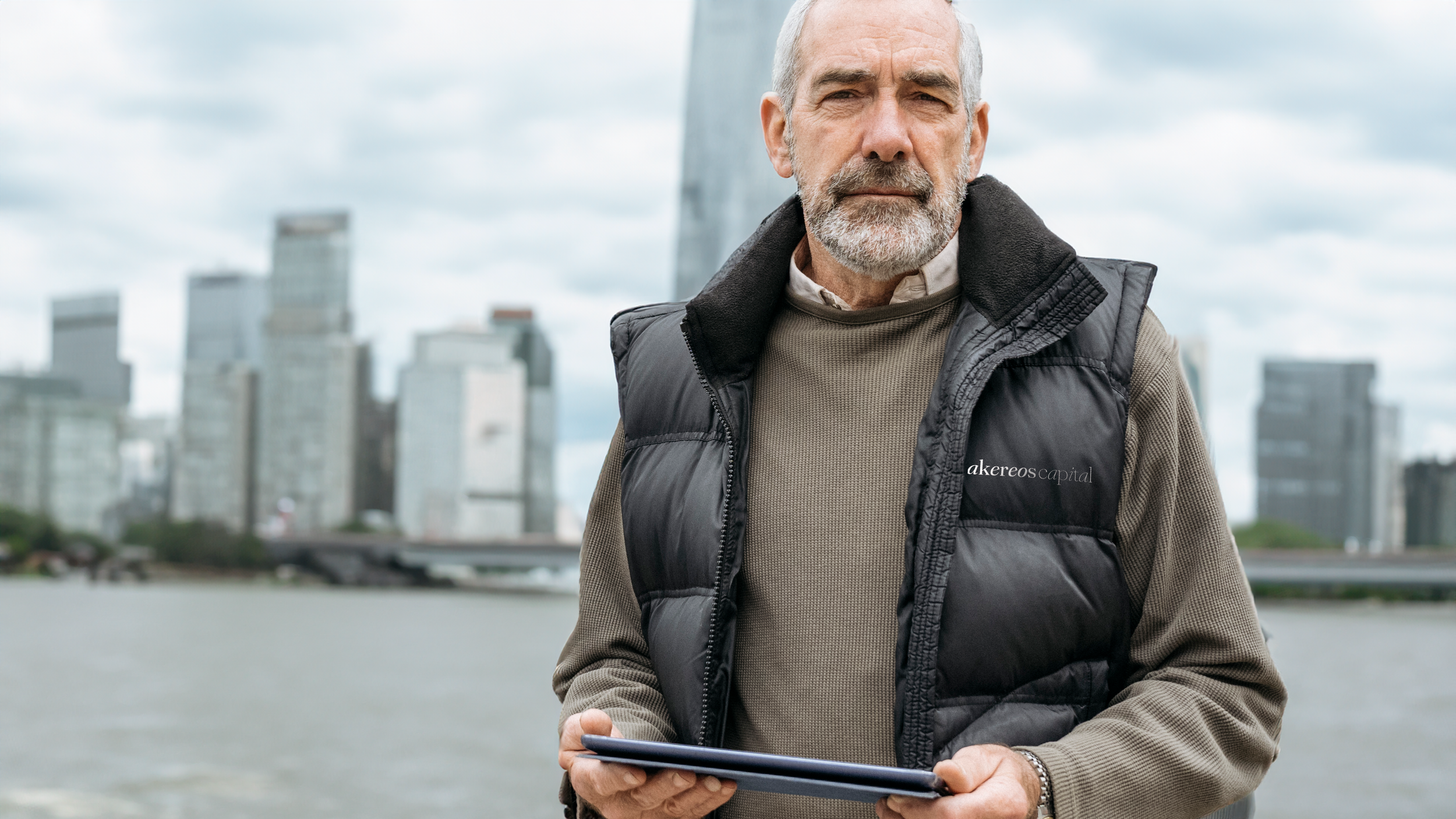
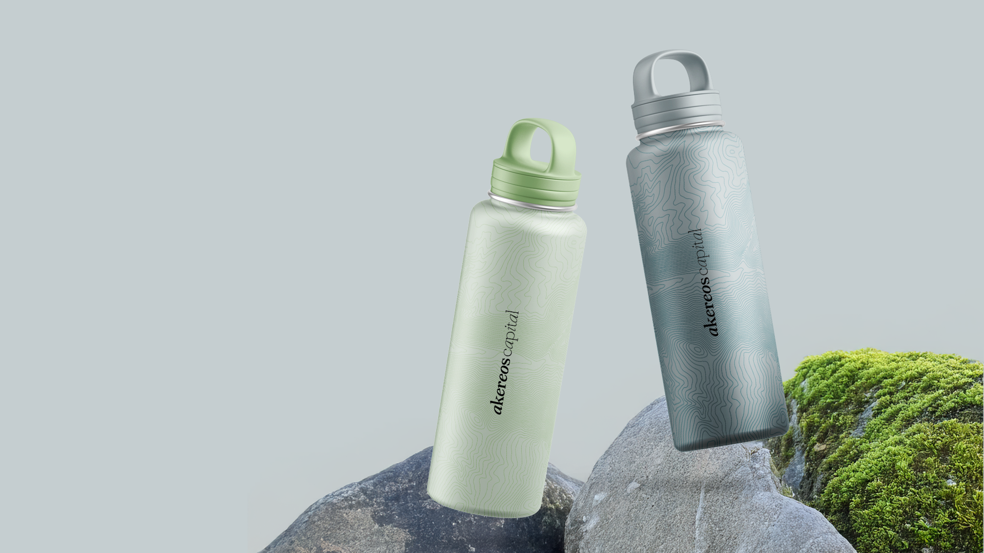
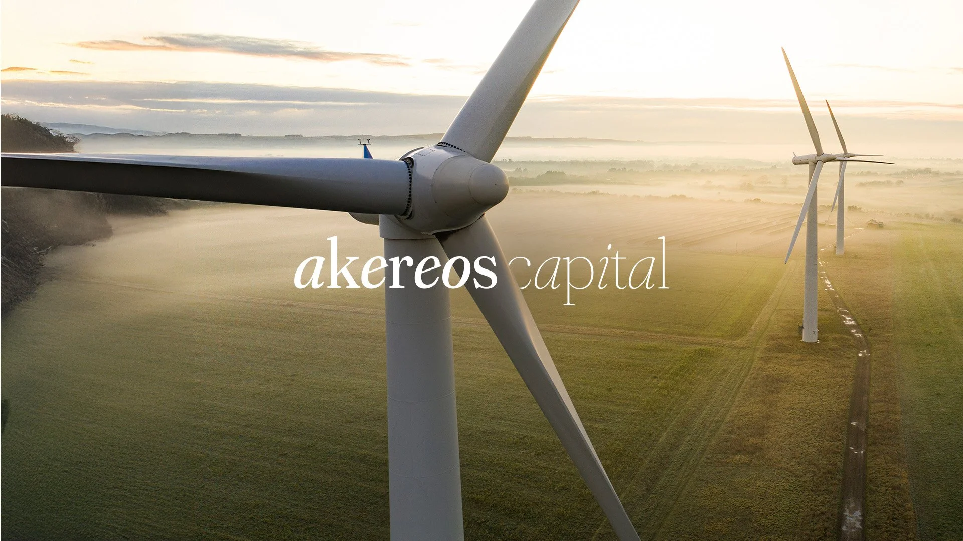
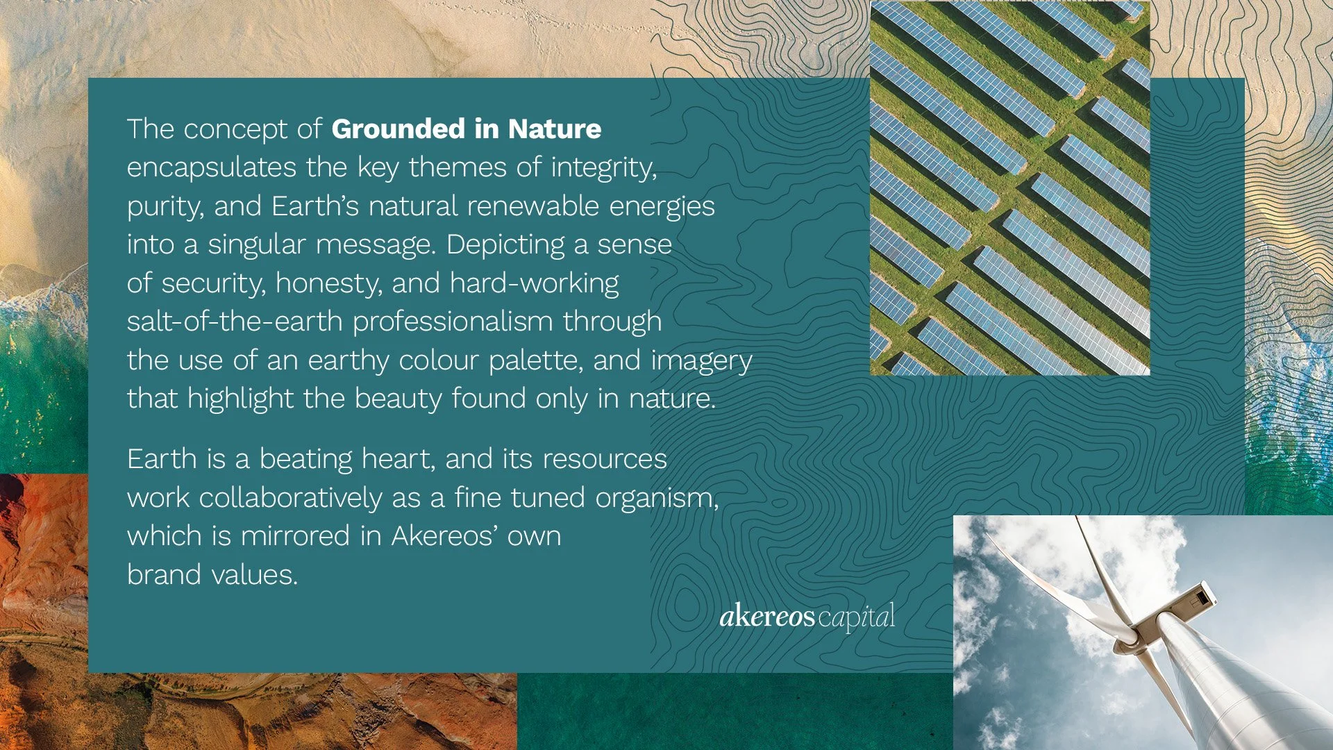
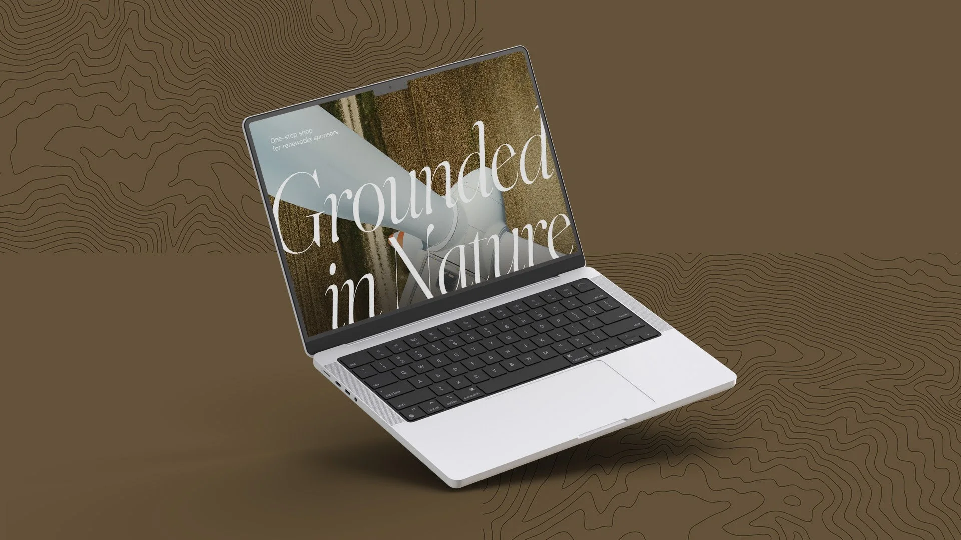
Akereos is the Greek word for Integrity. So for this green energy client we developed a concept titled Grounded in Nature, which combines the key themes of integrity, purity, and Earth’s natural renewable energies into a singular message. Depicting a sense of tradition & legacy, security, and honesty, through the use of an earthy colour palette, and imagery that highlights the beauty found only in nature.
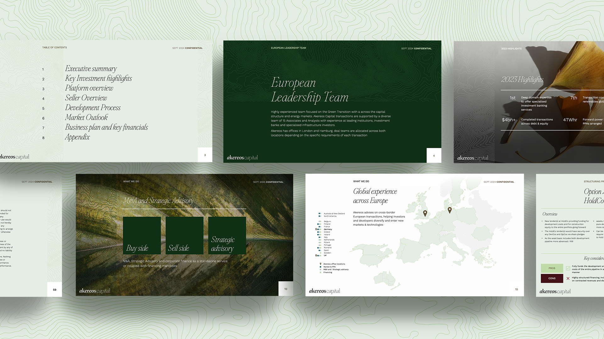
The rebrand included a new logo, colour palette and photography style, as well as the original powerpoint and roll out across multiple marketing materials.
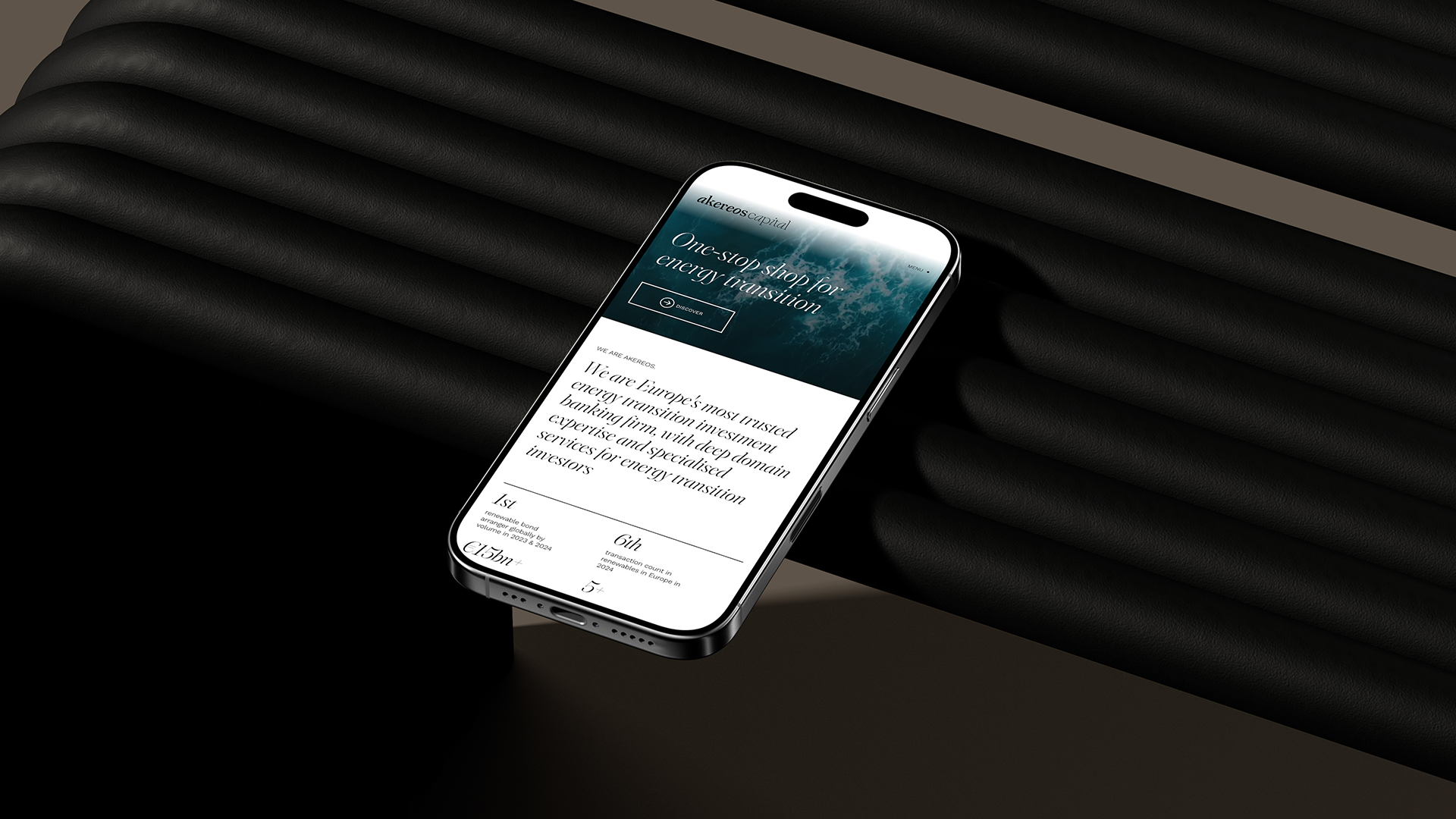
After having built a strong relationship with the client, we also encouraged them to develop a new website from scratch.
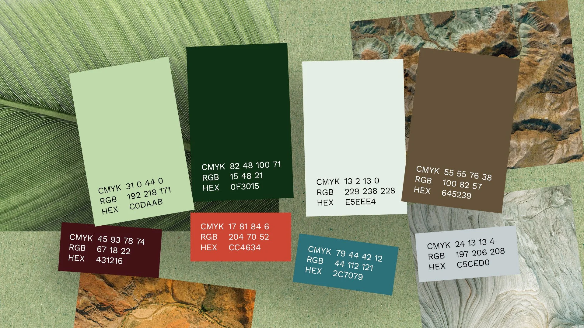
While the client gave us free reign on the identity, their one request was to use green as the key colour, alluding to the business’ crucial role within the green energy sphere.
To further highlight this relationship, we used topographical contours as both a nod to the earth’s ever-changing and delicate landscape, but also as a design element to frame images and add texture to backgrounds.