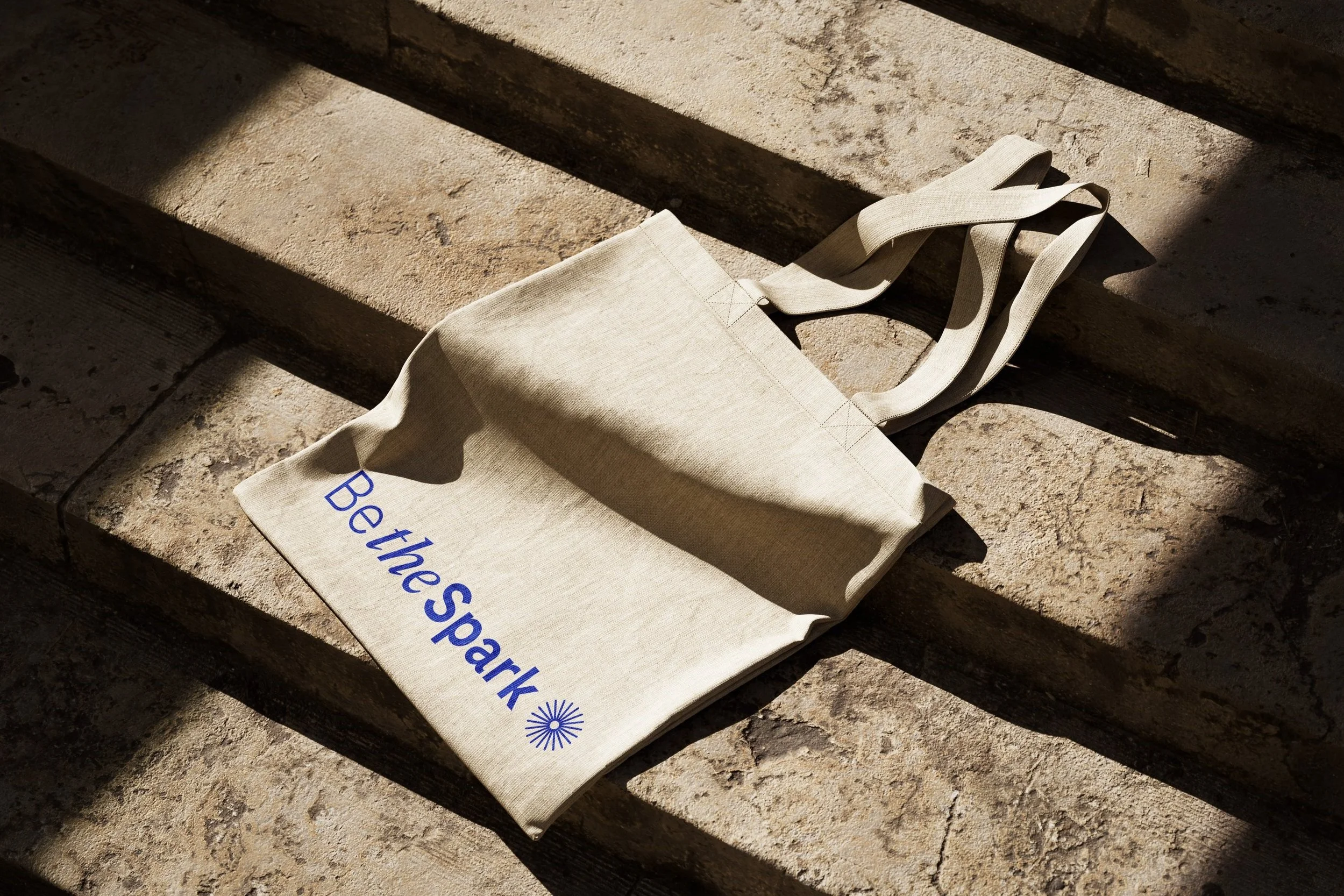
Be the Spark concept
for Roche
PROJECT: Visual Identity
ROLE: Logo, website concept, presentation animation.
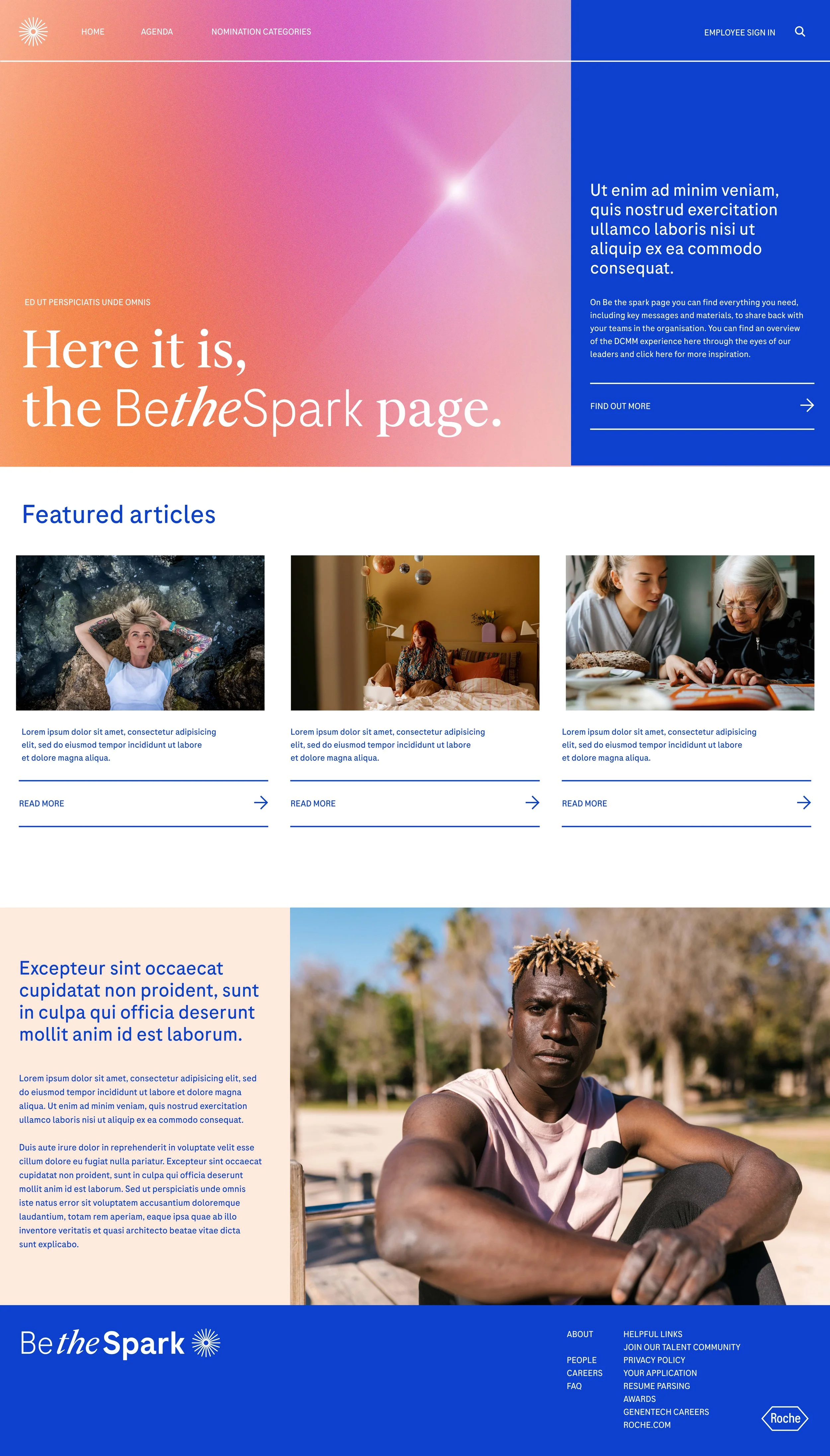
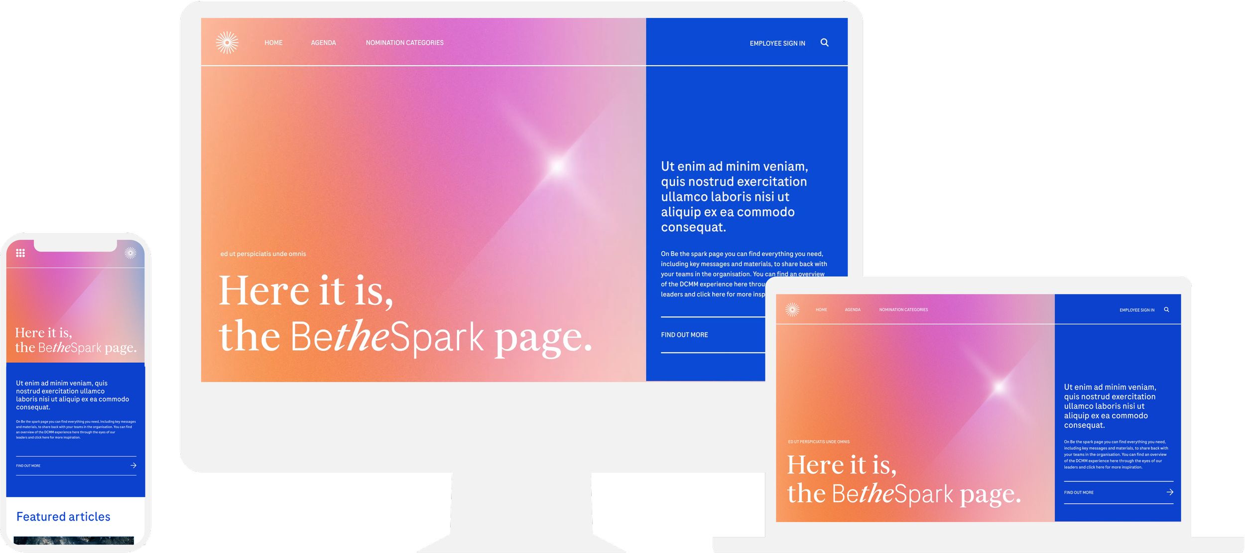
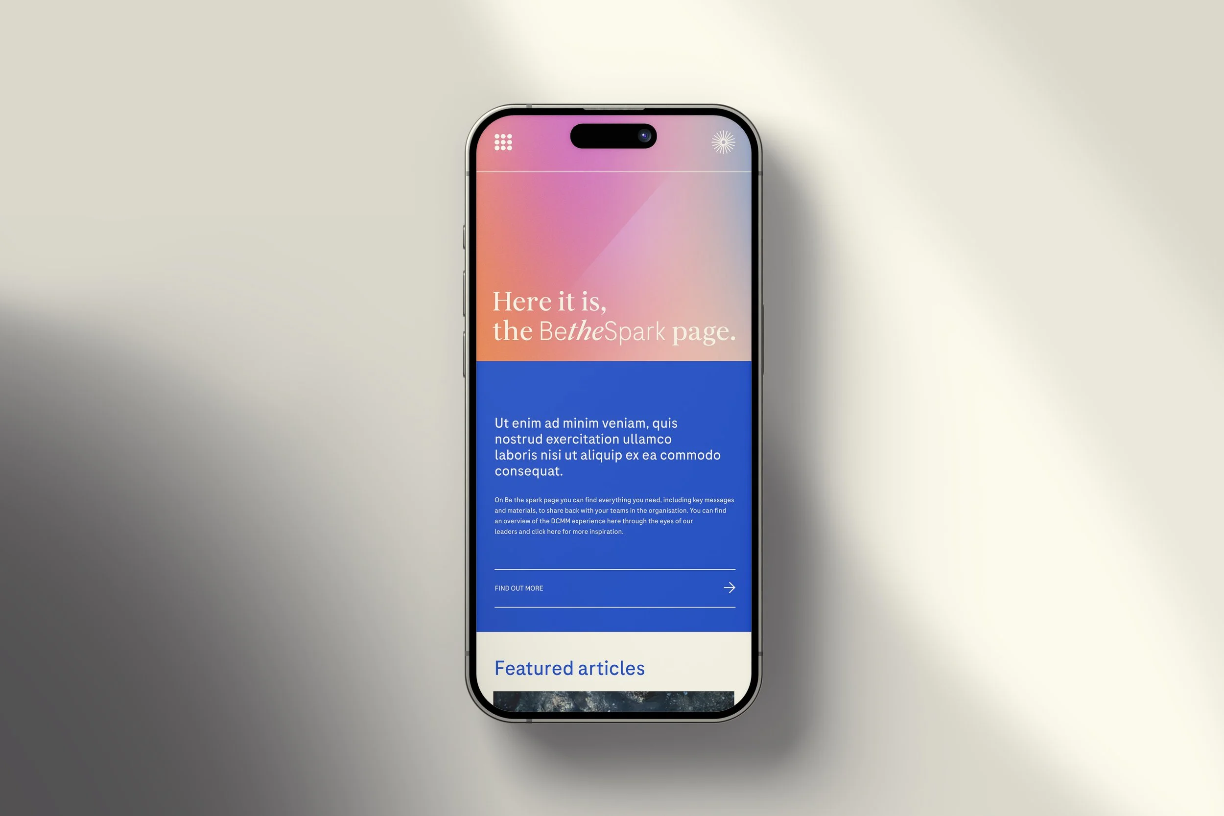
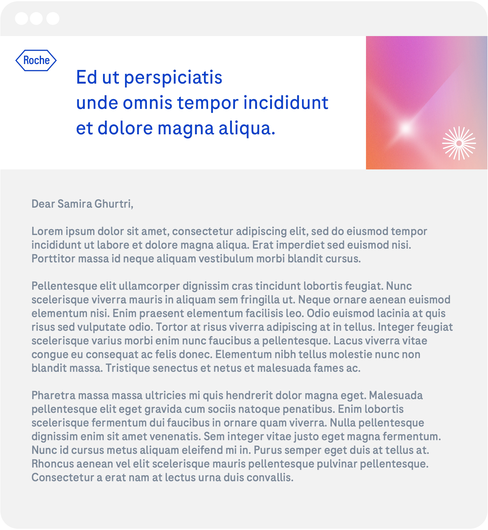
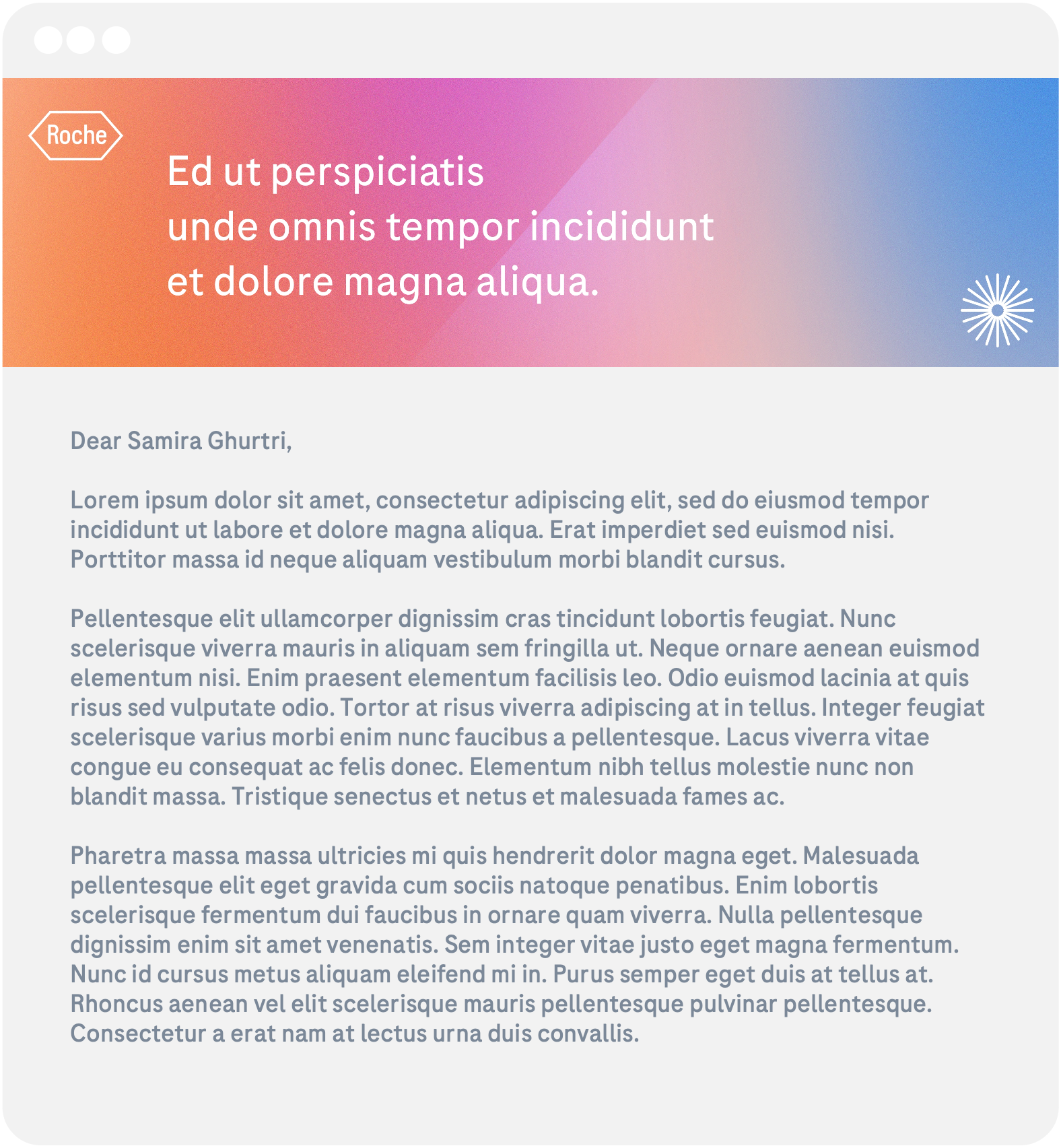
Roche asked our team to develop an identity for their internal employee initiative, Be the Spark. The presentation of the work included developing a logo, a concept for a website, email headers, and ideas for physical collateral.
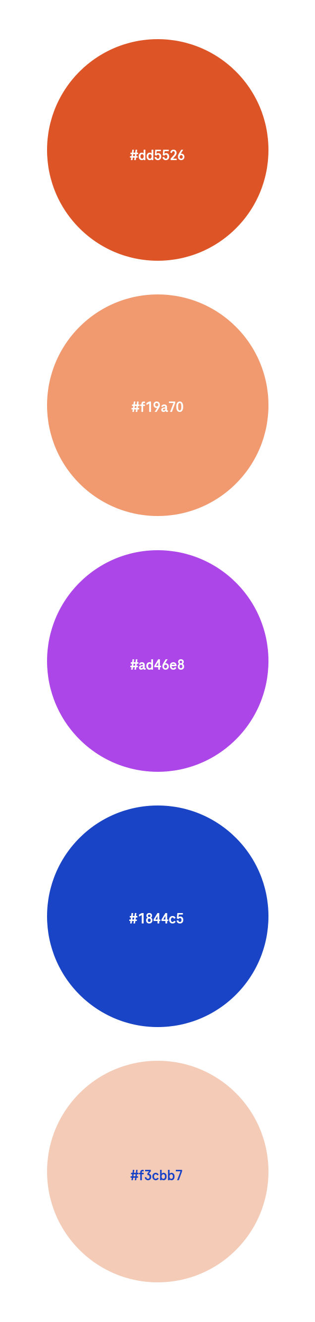
Set in the same style as accompanying icons and graphics, I introduced the new icon as part of the logo, which could be used on its on or on the tail end of the wordmark. To ensure consistency between the consumer-facing brand and their internal endeavours, I used the company’s existing fonts and graphics. However, in an effort to set apart and highlight the great impact of the employees' contribution, I opted for their secondary colour palette which uses brighter and more vibrant tones.
Using the 49 degree angle, which is intrinsic to the Roche brand, I also wanted to incorporate a new feature, the Spark, which through the use of animation on the intranet site, glimmers as it moves across the screen.