Black Tomato Homepage Redesign
PROJECT: Mobile Concept
ROLE: UX and design.
Some details across the Black Tomato website were in need of some fine-tuning, so I received a brief from the Creative director to address a few of the challenges the design team were facing. It appeared as though users to the site weren’t responding to the CTA quick enough, and delaying the time they reached the pages that ultimately lead to completing a purchase.
Below outlines some of the heuristics I addressed in my proposal.
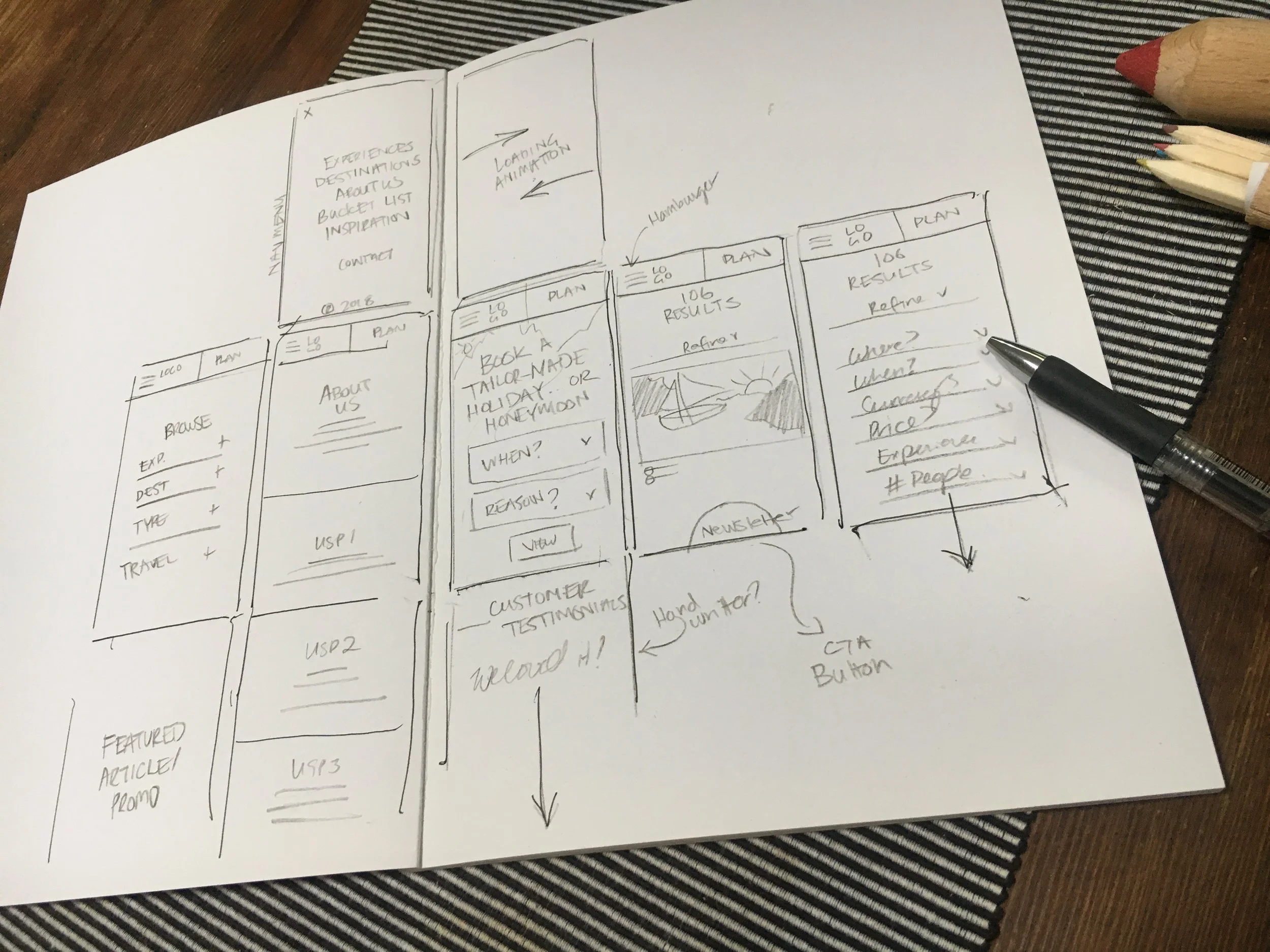
The team requested I analyse the functions of competitor websites and compared them to what BT was doing. I collected some inspiration from various sites and conducted some additional research on the type of consumer that might frequent the site.
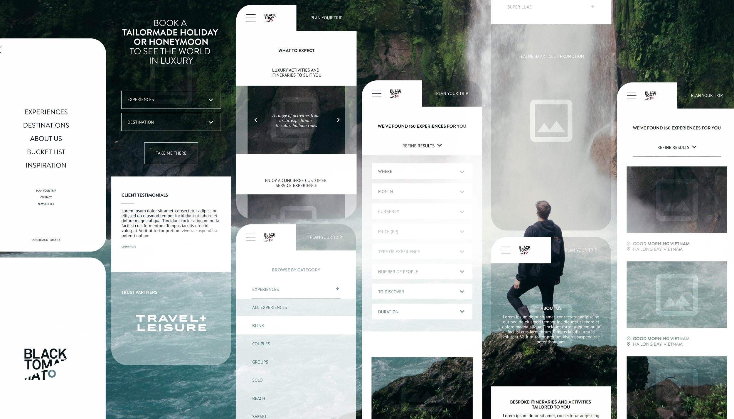
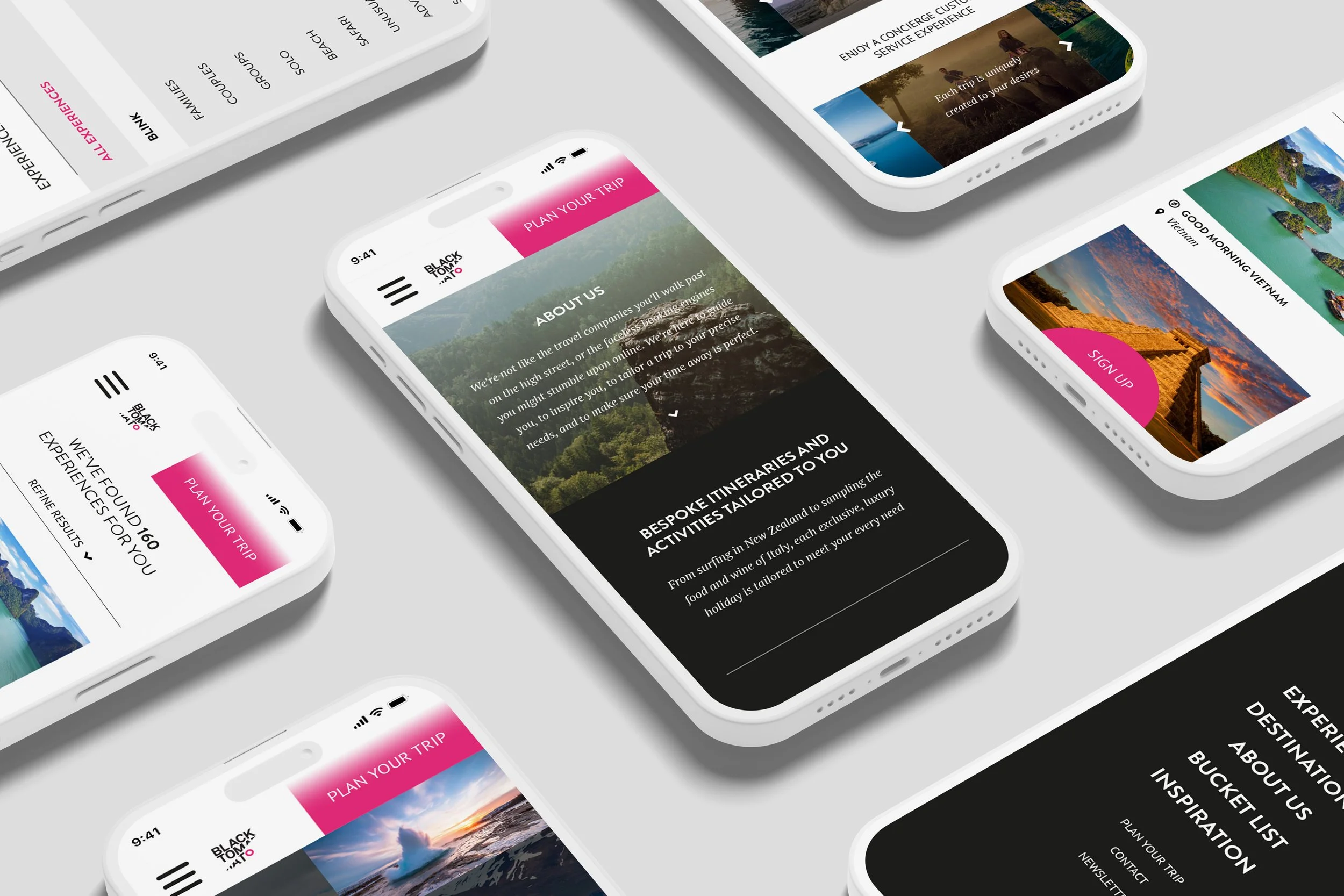
My presentation included a mobile-first design, addressing a number of the team’s requests such as making the Plan your Trip and Newsletter Sign Up functions clearer, organising the information within the screen, and the development of a new ‘features’ page.
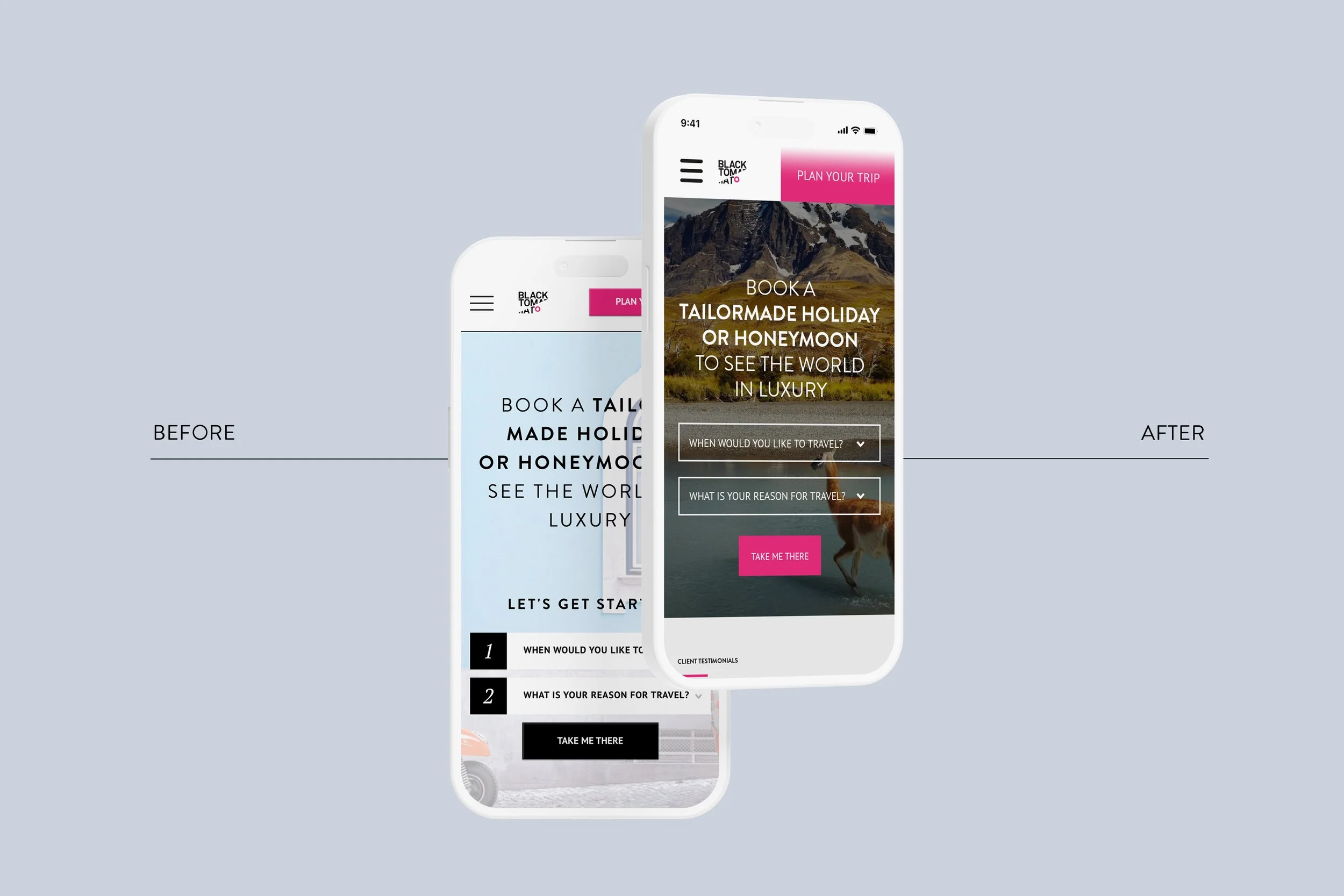
For the Trip Finder and Newsletter requests, I suggested modernising the Plan your trip button to assume half the width of the screen, and removed the drop shadows on the outside of the shape. I kept the alignment of the button next to the logo and hamburger menu, and suggested fixing the upper navigation bar when scrolling.
I simplified the Trip Planner function by eliminating the Let’s get started text, and proposed minimalist buttons with a white outline, and brand pink CTA to inform which steps to take in order, and to compensate for removing the numbers.
I also thought a background image with richer colours and a semi-transparent black overlay would help the buttons stand out better.
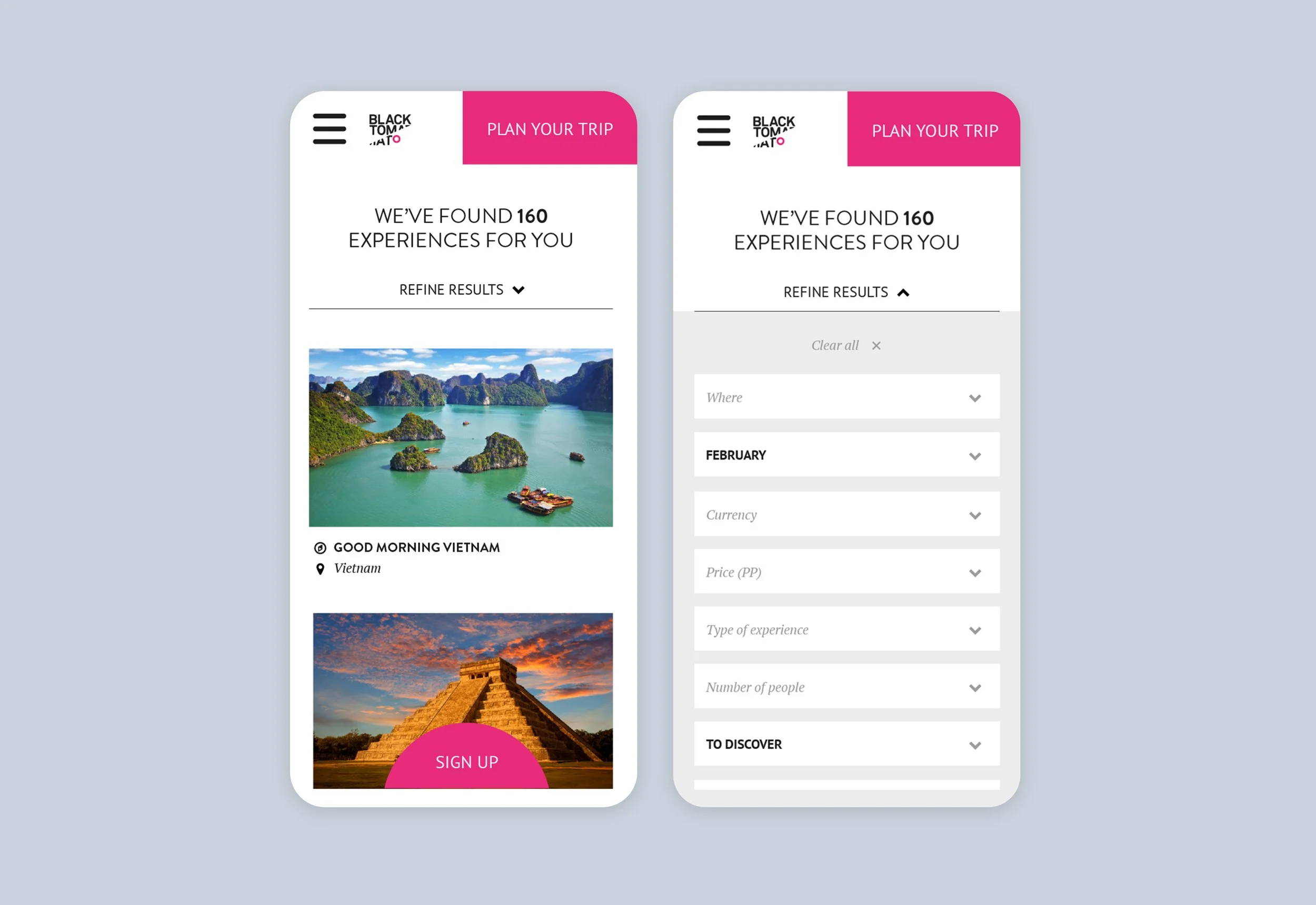
Once the user had entered their top two criteria (when to travel and reason for travel) into the drop down boxes, they were lead to the results page where they could enter more items to refine their search. I suggested collapsing this element until prompted by the user, and once expanded, sit within a grey shape rather than white, to organise the information more succinctly. I recommended that the name of the field should be replaced by the user’s selection to further simplify the appearance, and since time of travel and reason for travel has already been selected, these elements would automatically appear in the form.
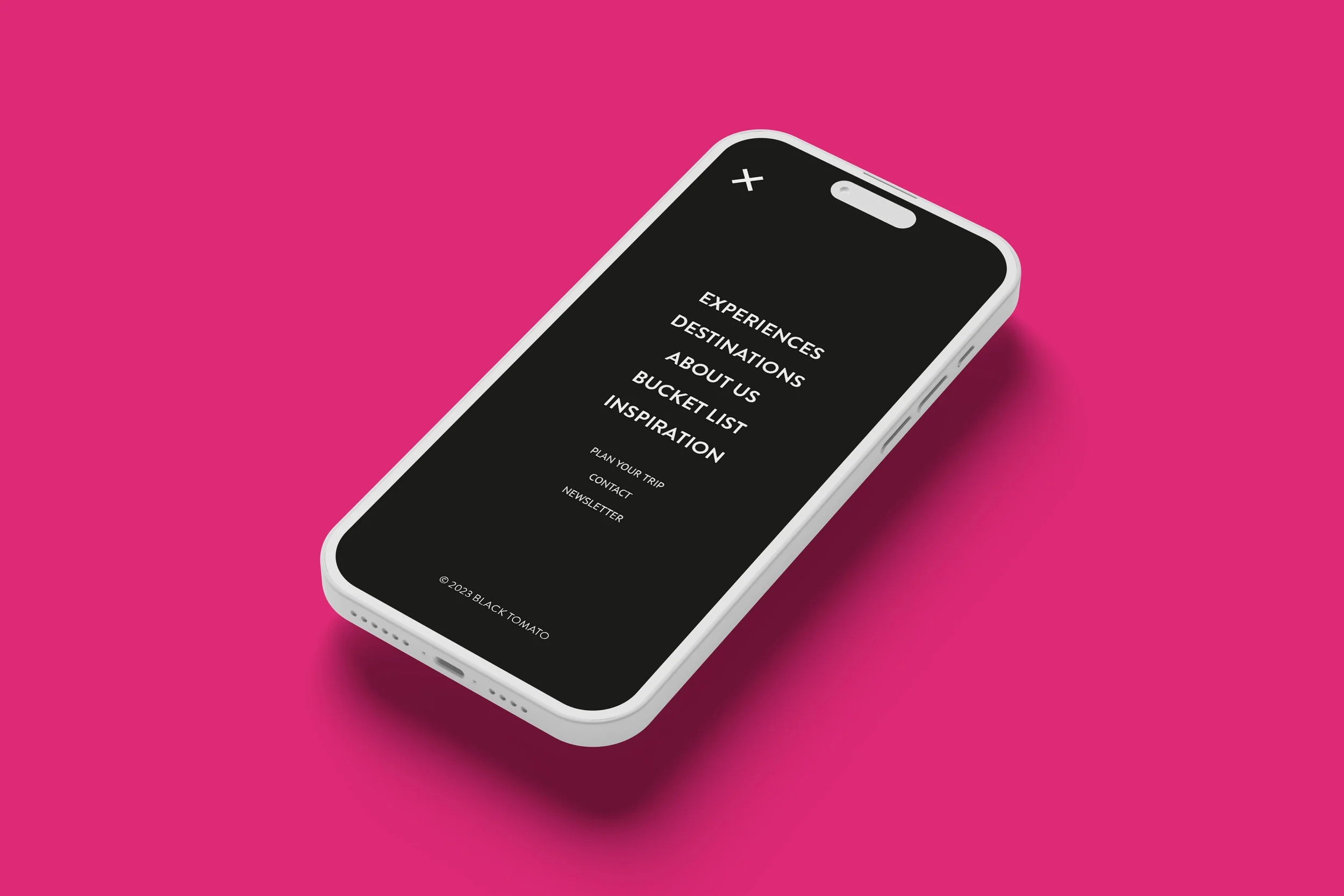
I also drew up plans for a full-page menu overlay for clear and simple page navigation.
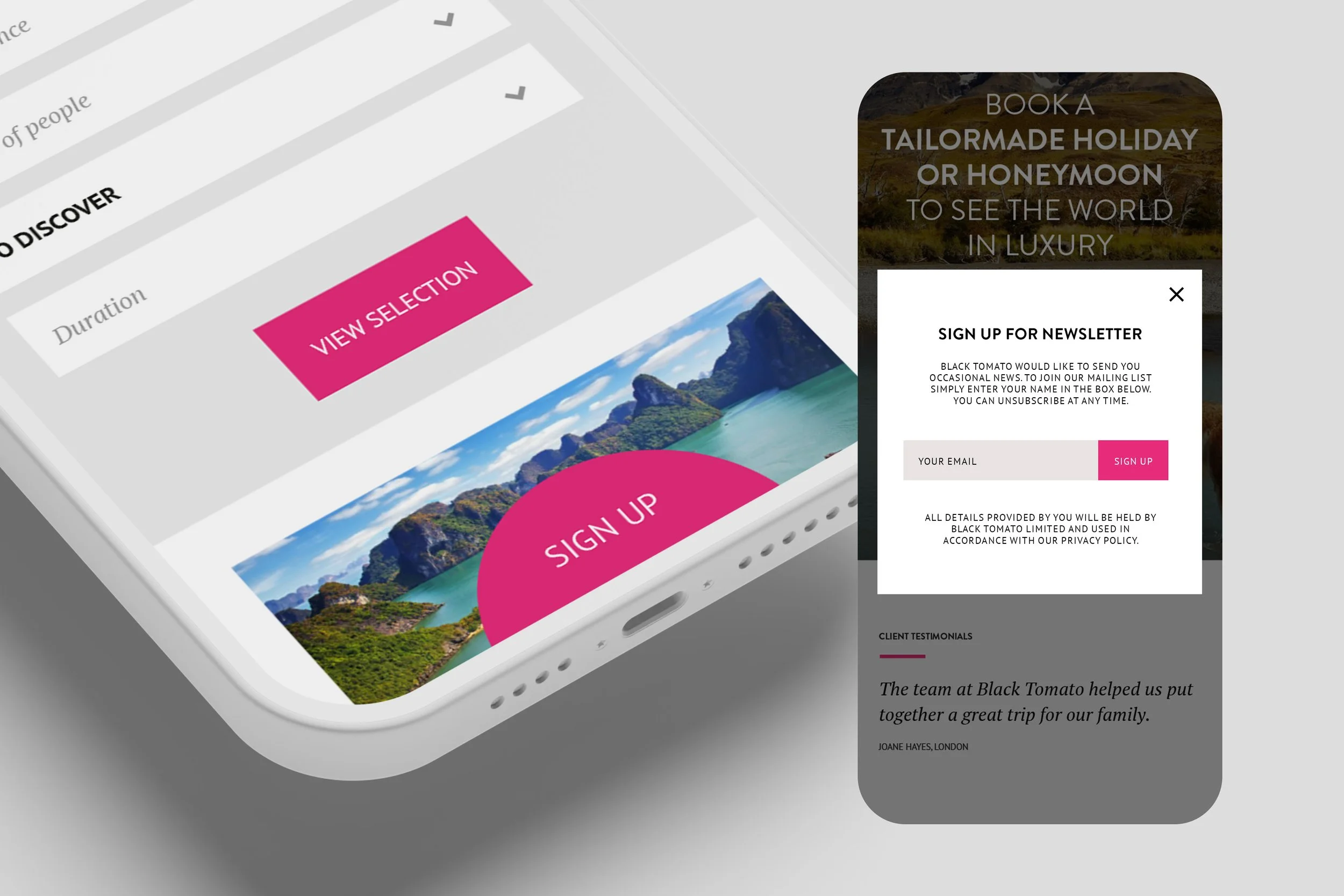
As signing up to BT’s newsletter was a priority for the team, I introduced a half circle tab that sat fixed along the bottom of the screen, to ensure the CTA was always visible.
When clicked, the BT branded sign-up modal overlays the main window, creating less disruption to the user journey, and allowing the user to click out if unwanted, without a further step to return to the page they were viewing.
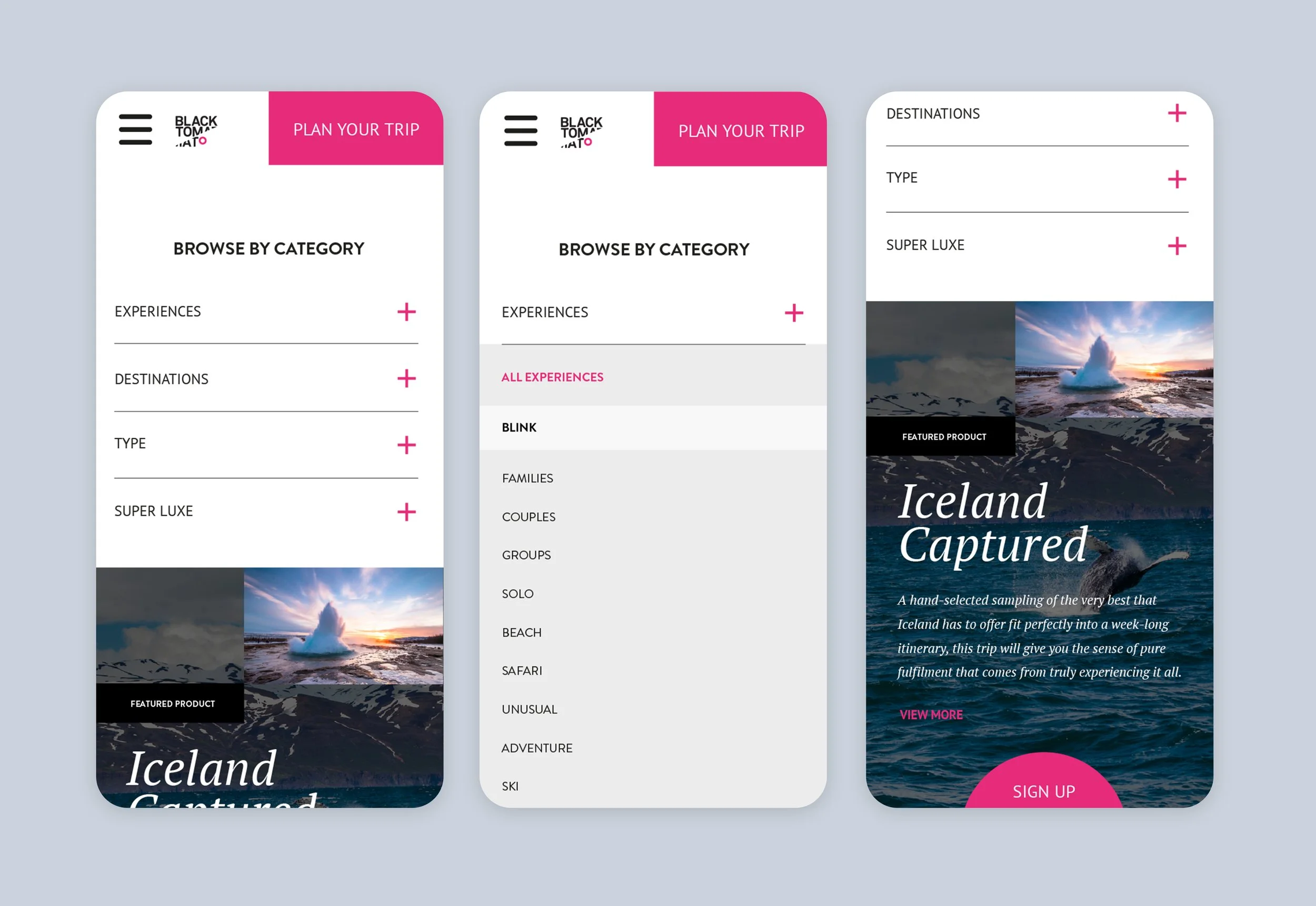
Another request was to create categories for the Browse element, as well as to introduce how a feature article or promotion may appear on the same page.
My aim was to create a hierarchy in which information was viewed and I suggested a collapsed menu here as well. I did not want the user to scroll to the bottom of the page, but to find the four main categories first before anything. Using a plus symbol, the user was invited to expand the section, where a multitude of options were then available. Any feature promotions or products would be highlighted in bold lettering within a white compartment, like the Blink promotion pictured right. The same article or promotion was featured immediately below (Blink/Iceland Captured).