Inspired Science branding
Project: Branding
Role: Art direction and design.
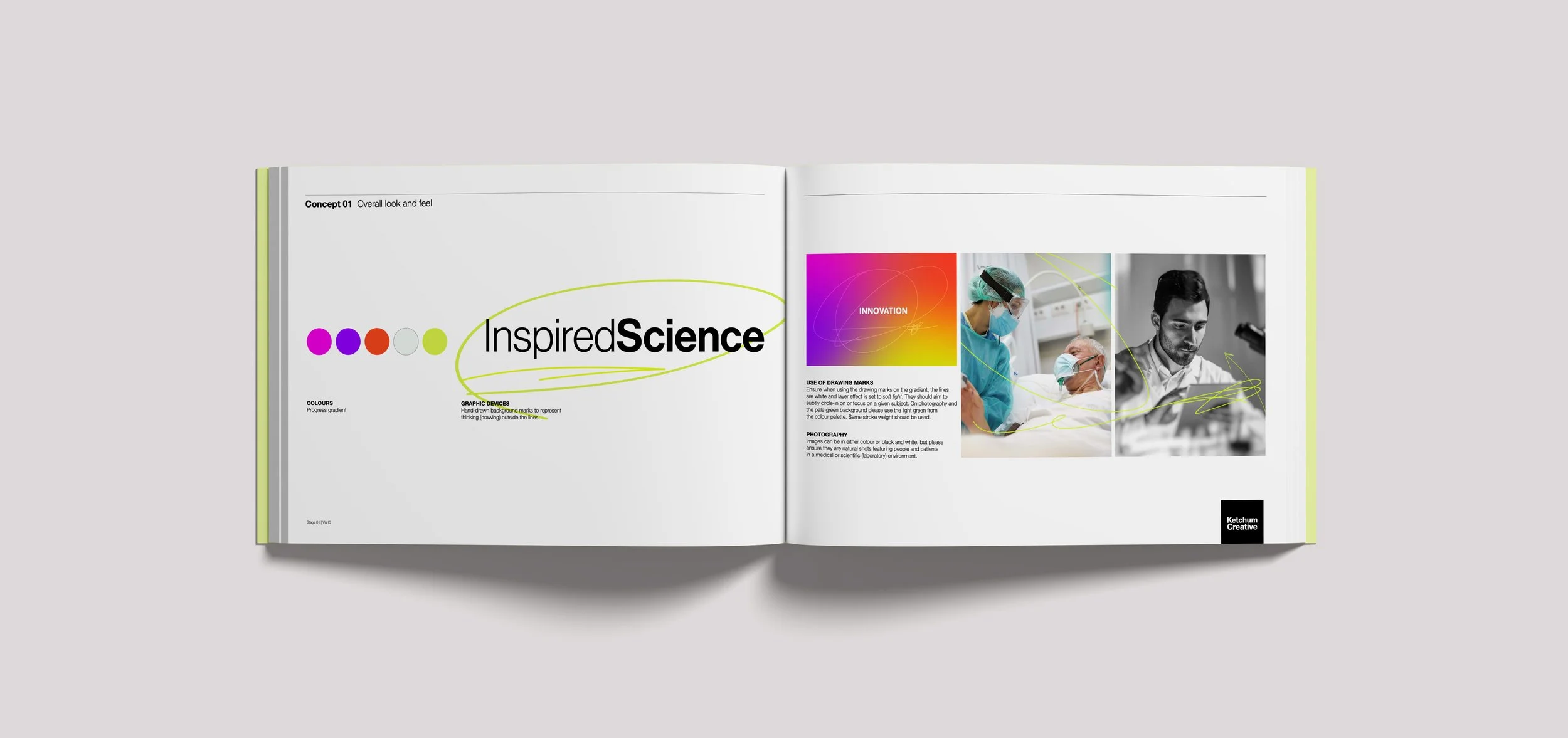
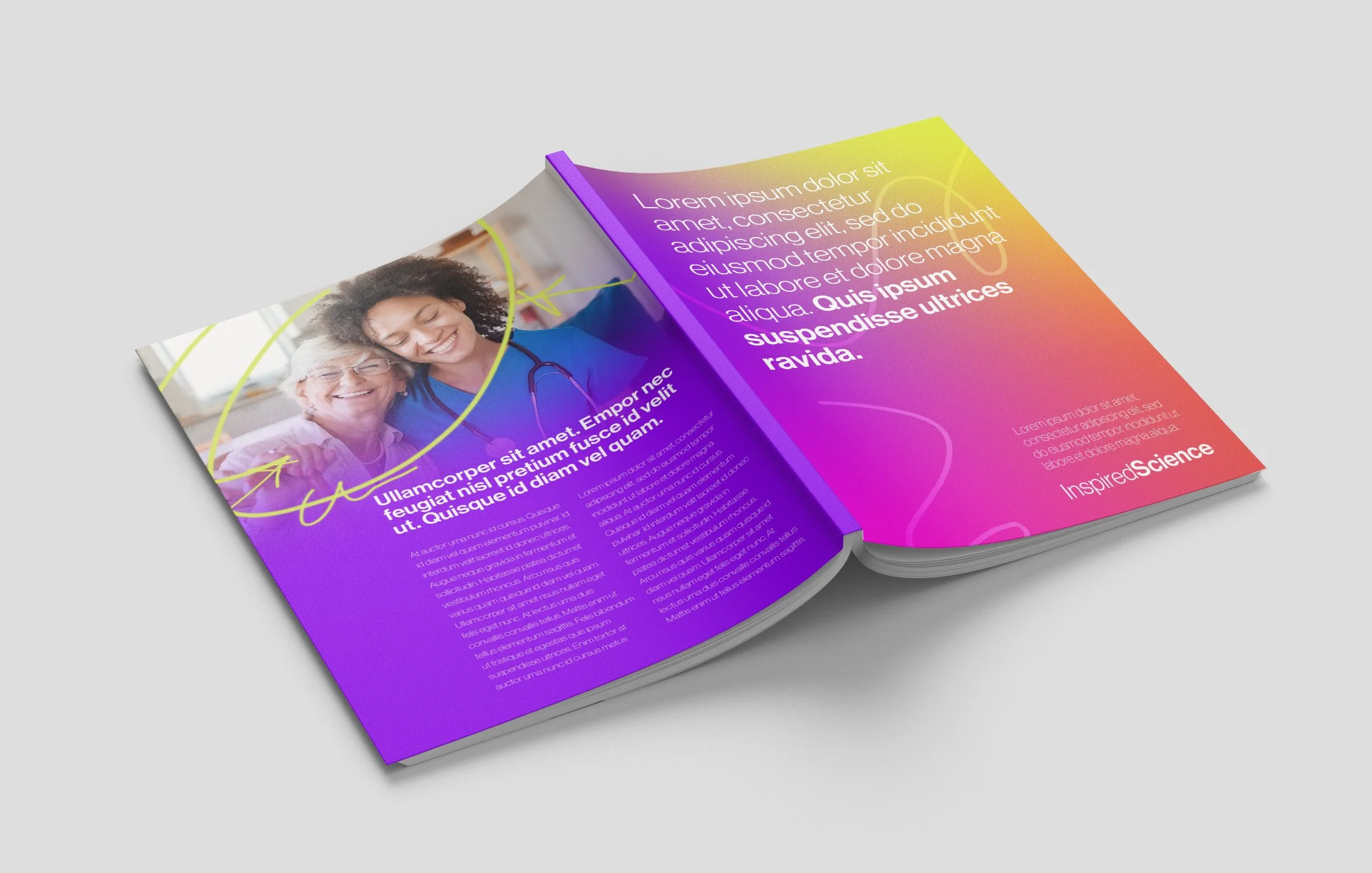
Inspired Science is a communications team within Ketchum London’s Health offering, comprising clinically-focused medical education & scientific specialists. For this concept, my aim was to reimagine the existing IS identity, and to combine this in harmony with the Ketchum Progress branding. Familiar attributes can be seen in the use of the super saturated gradient, as well as the Neue Haas Grotesk typeface.

‘Inspiration’ is a core value of IS and was championed through the use of hand-drawn lines overlayed in the background of branded content, to portray a sense of drawing outside the lines or thinking outside the box. The lines are used as a graphical device in animations and layouts as marks and as a means to highlight or organise information and text.
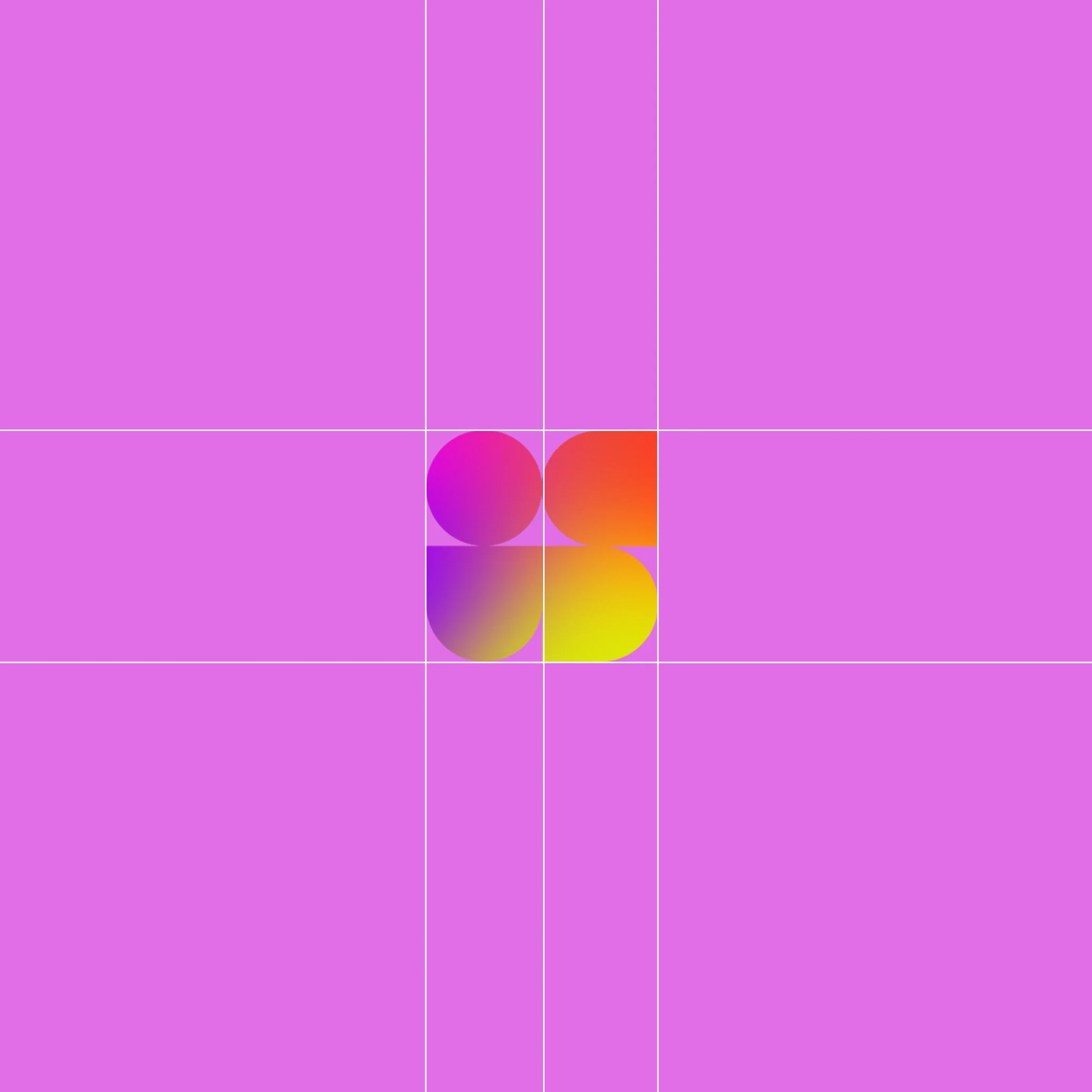
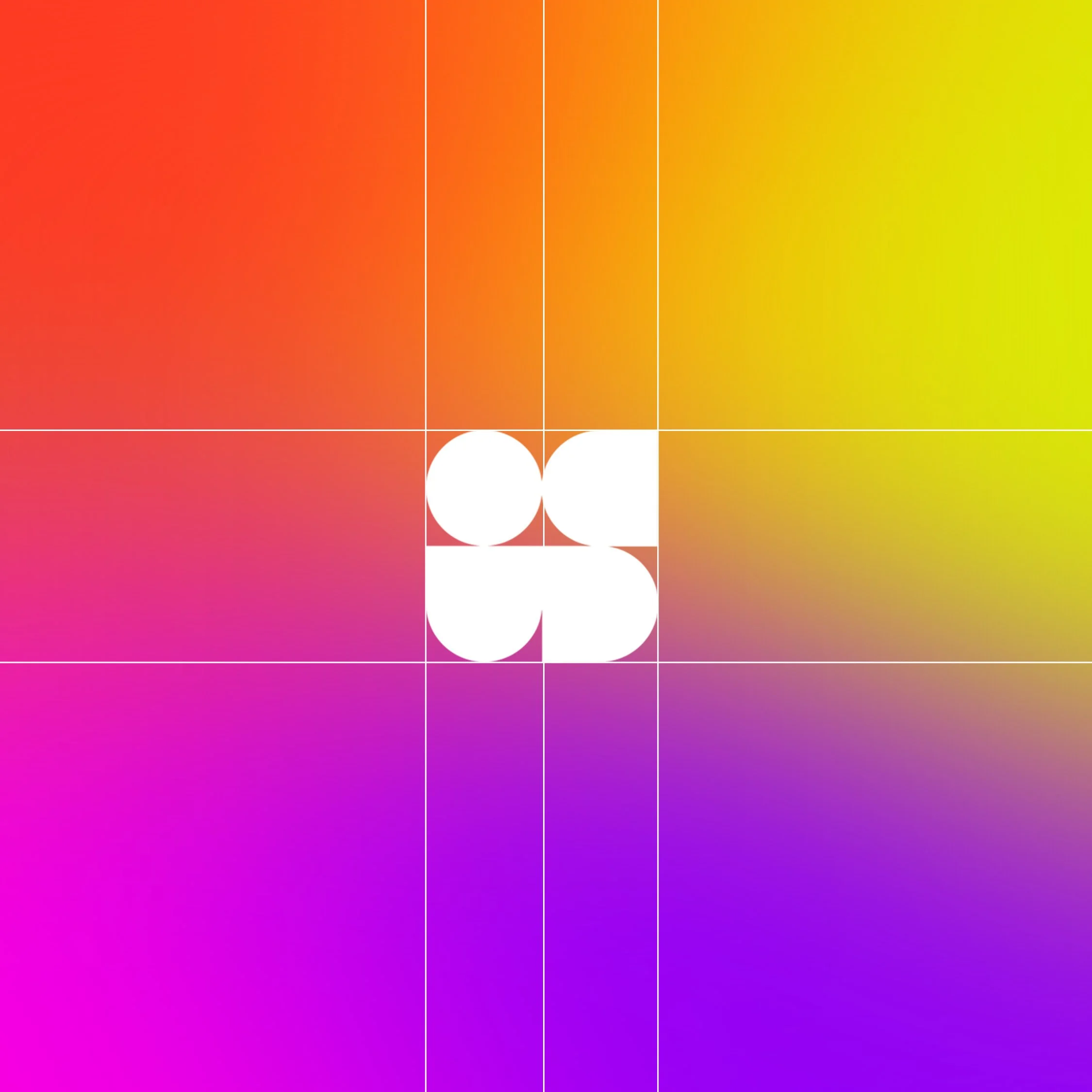
The logo is a geometric abstraction of the letters I + S, which can be used solo to create simplicity and clarity when used across various visuals, or together with the additional word mark for Inspired Science.
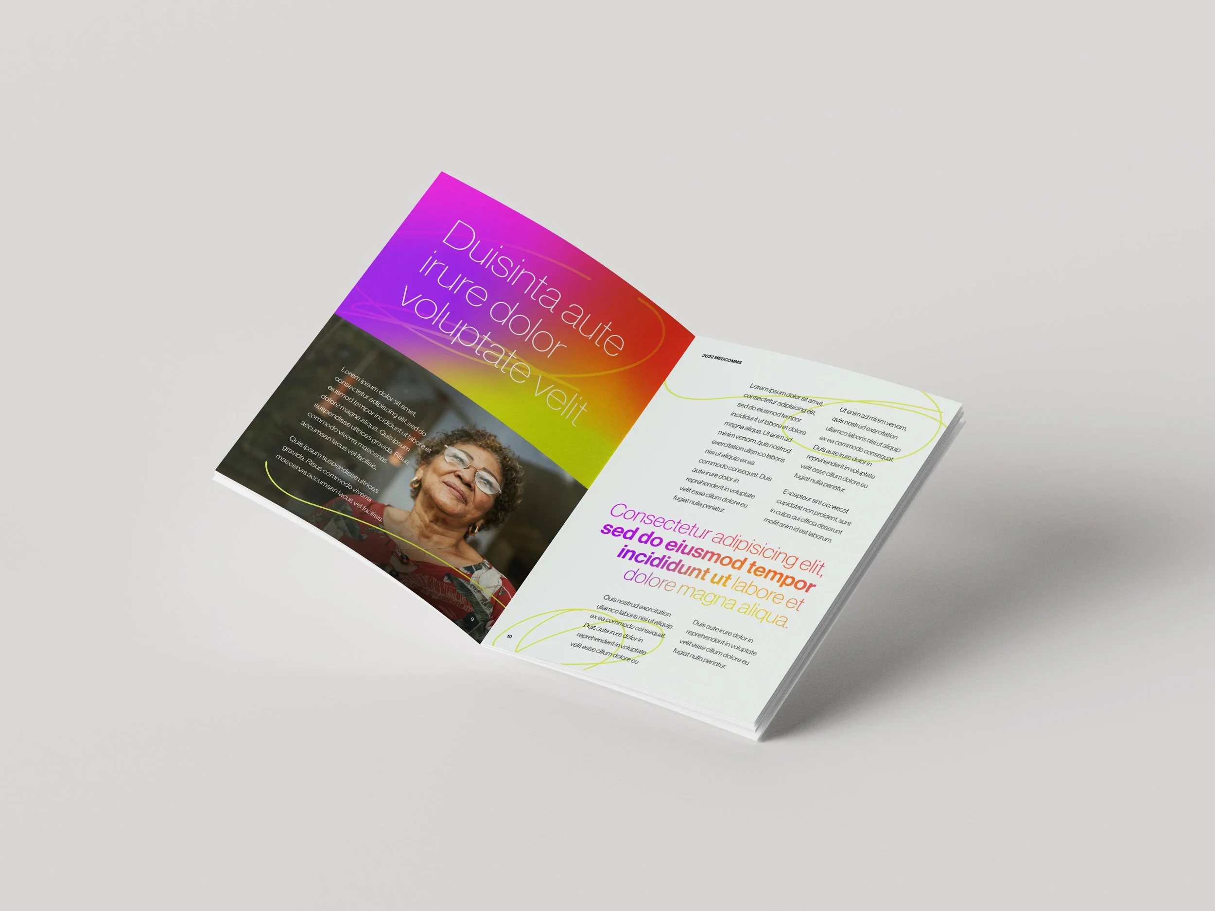
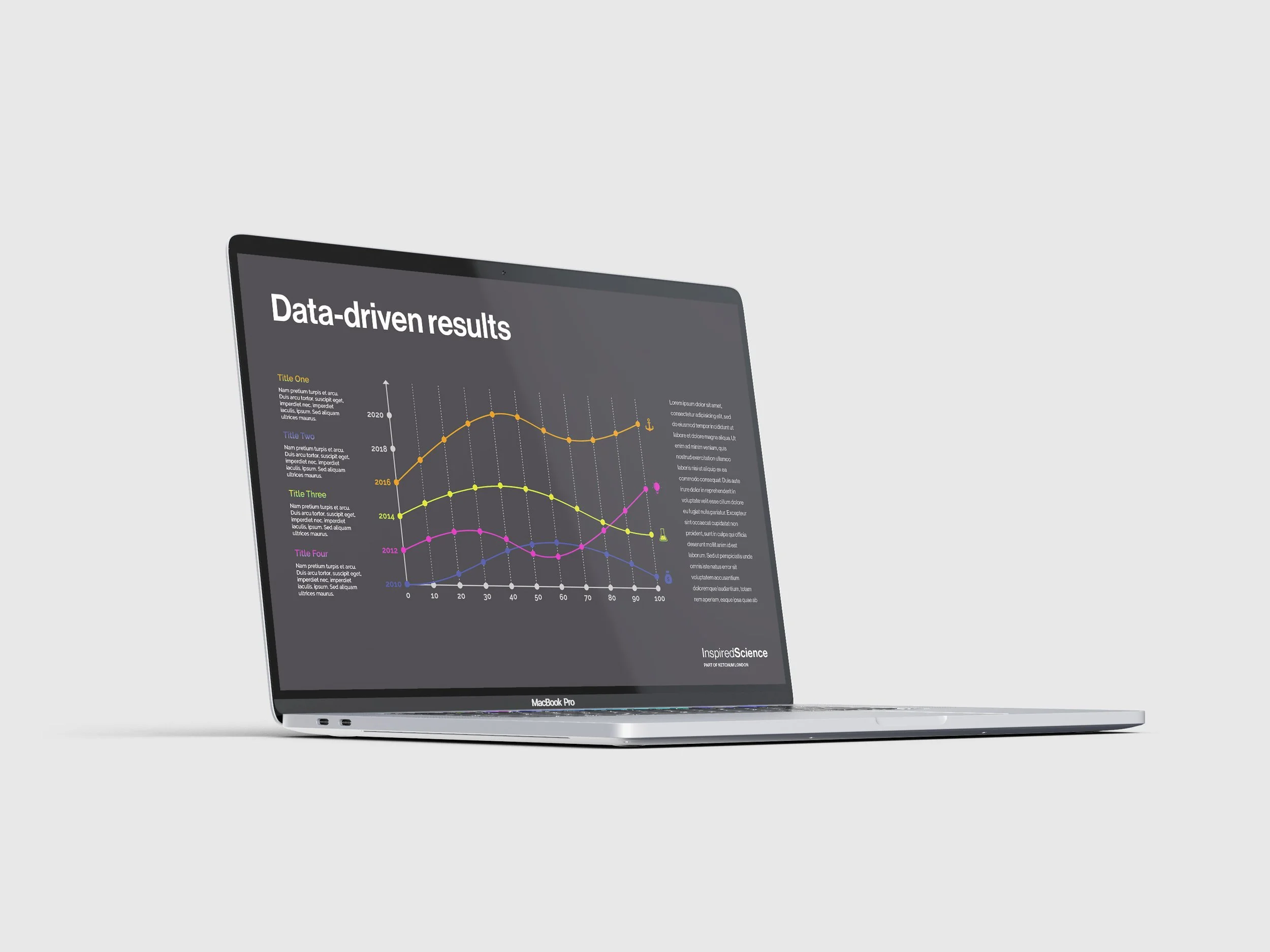
A number of touch-points including a website and event collateral were developed to demonstrate how this identity can be rolled out.